---
title: "Why Is Determining Causality So Hard?"
subtitle: "Bonus notes: confounders, the law of total probability, and counterfactuals"
format:
html:
toc: true
toc-depth: 3
number-sections: true
code-fold: show
code-tools: true
fig-width: 7
fig-height: 4.5
fig-align: center
knitr:
opts_chunk:
warning: false
message: false
comment: "#>"
---
```{r}
#| label: setup
#| include: false
library(tidyverse)
library(infer)
library(broom)
set.seed(2024)
theme_set(theme_minimal(base_size = 12))
```
# A simple example: ice cream and drownings
Let's take a deliberately silly example to study causality: **ice cream sales per
day** and **the number of drownings per day**.
Does anyone think that more people drowning *causes* ice cream sales to go up?
Of course not. But let's use the statistical tools we have learned so far and see
what they tell us — because every one of them is going to say these two variables
are related.
## Setting up a model of the world
I'm going to model this as if there are only two times of year: **W**inter and
**S**ummer.
| Time of year | Drownings | Ice cream sales |
|:-------------|:----------|:----------------|
| Winter | $N(\mu = 5,\ \sigma^2 = 1)$ | $N(\mu = 5,\ \sigma^2 = 1)$ |
| Summer | $N(\mu = 20,\ \sigma^2 = 25)$ | $N(\mu = 20,\ \sigma^2 = 25)$ |
The critical thing to notice: **within a season, I am drawing the two variables
completely independently.** There is no causal link anywhere in this data
generating process. Whatever relationship we find is something we manufactured
by not looking at the season.
Note that `rnorm()` takes a *standard deviation*, not a variance, so
$\sigma^2 = 25$ becomes `sd = 5`.
Note, why did I pick these numbers? Recall a normal lives most of the time within $2\sigma$ (2 standard deviations) of it's mean. So I made these numbers so that winter ice cream is about $5 \pm 2$ and summer is about $20 \pm 2(5)=20 \pm 10$ to give reasonable scales.
```{r}
#| label: simulate-data
n_each <- 100

ice_cream <- tibble(
  time_of_year = rep(c("Winter", "Summer"), each = n_each),
  drownings = c(
    rnorm(n_each, mean = 5,  sd = 1),
    rnorm(n_each, mean = 20, sd = 5)
  ),
  sales = c(
    rnorm(n_each, mean = 5,  sd = 1),
    rnorm(n_each, mean = 20, sd = 5)
  )
) |>
  mutate(time_of_year = factor(time_of_year, levels = c("Winter", "Summer")))

glimpse(ice_cream)
```
## The plot that tells the truth
```{r}
#| label: fig-scatter-colour
#| fig-cap: "Ice cream sales against drownings, coloured by time of year. The two clusters are the whole story."
ggplot(ice_cream, aes(x = drownings, y = sales, colour = time_of_year)) +
  geom_point(size = 2, alpha = 0.85) +
  scale_colour_manual(values = c(Winter = "#3d7ea6", Summer = "#e2a33c")) +
  labs(
    x = "Drownings per day",
    y = "Ice cream sales per day",
    colour = "Time of year",
    title = "With the season visible, the structure is obvious"
  )
```
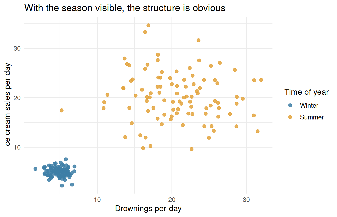
Looking at @fig-scatter-colour, we can clearly see that *time of year* is what is
really doing the work here. There are two blobs. Inside each blob, the points are
just noise — no tilt, no trend.
## The same plot with the colour turned off
```{r}
#| label: fig-scatter-nocolour
#| fig-cap: "Exactly the same data, with the season hidden. Now it looks like a relationship."
ggplot(ice_cream, aes(x = drownings, y = sales)) +
  geom_point(size = 2, alpha = 0.85, colour = "grey25") +
  geom_smooth(method = "lm", se = FALSE, colour = "#c05e5e") +
  labs(
    x = "Drownings per day",
    y = "Ice cream sales per day",
    title = "With the season hidden, we 'find' a strong relationship"
  )
```
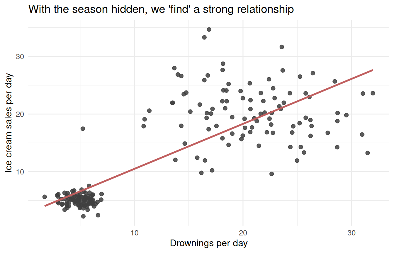
From @fig-scatter-nocolour alone, it really does look like drownings and ice
cream have a relationship. Nothing about the picture warns you that you are
looking at two clusters rather than one trend.
# What our tools say
## Linear models
If I fit `sales ~ drownings + time_of_year`, the model will fit a slope near zero
for `drownings` and give a different intercept to each season:
```{r}
#| label: model-with-season
lm(sales ~ drownings + time_of_year, data = ice_cream) |>
  tidy() |>
  mutate(across(where(is.numeric), \(x) round(x, 3)))
```
If I model `sales ~ drownings` alone, it fits a solidly positive slope:
```{r}
#| label: model-without-season
lm(sales ~ drownings, data = ice_cream) |>
  tidy() |>
  mutate(across(where(is.numeric), \(x) round(x, 3)))
```
So if I never get to see the time-of-year data, my linear model tells me that ice
cream and drownings **do** have a relationship — that they are **not**
independent.
## Correlation
The correlation is large and positive too:
```{r}
#| label: correlation
cor(ice_cream$drownings, ice_cream$sales)
```
But split it by season, and it evaporates:
```{r}
#| label: correlation-by-season
ice_cream |>
  group_by(time_of_year) |>
  summarise(correlation = cor(drownings, sales))
```
This is the same fact @fig-scatter-colour showed us, written as a number.
## A permutation test with `infer`
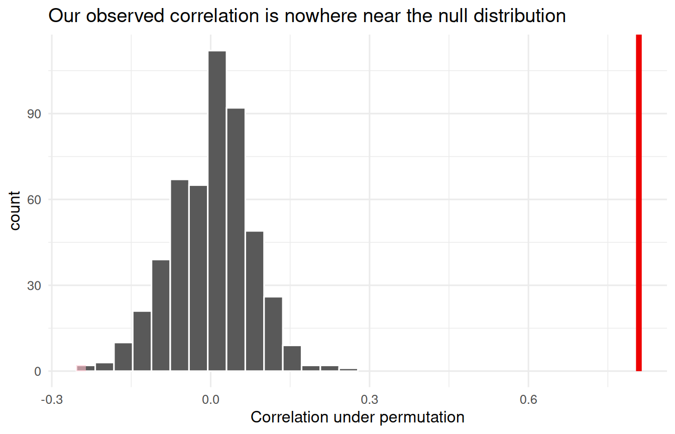
Think of each ice cream value and each drowning value as being *paired up*: high
sales usually go with high drownings. Now imagine shuffling one column, so that
each drowning value gets paired with a randomly chosen ice cream value. If the
two variables were genuinely unrelated, our observed correlation should look
unremarkable next to the correlations we get from those shuffles.
Let's do that 500 times.
```{r}
#| label: infer-observed
observed_cor <- ice_cream |>
  specify(sales ~ drownings) |>
  calculate(stat = "correlation")

observed_cor
```
```{r}
#| label: infer-null
null_dist <- ice_cream |>
  specify(sales ~ drownings) |>
  hypothesize(null = "independence") |>
  generate(reps = 500, type = "permute") |>
  calculate(stat = "correlation")
```
```{r}
#| label: fig-null-dist
#| fig-cap: "Null distribution of the correlation under 500 permutations, with the observed statistic marked."
visualize(null_dist) +
  shade_p_value(obs_stat = observed_cor, direction = "two-sided") +
  labs(
    x = "Correlation under permutation",
    title = "Our observed correlation is nowhere near the null distribution"
  )
```
```{r}
#| label: infer-pvalue
get_p_value(null_dist, obs_stat = observed_cor, direction = "two-sided")
```
Under a null of $\rho = 0$, we would **reject the null**. So even our hypothesis
test seems to point at a causal relationship between the two.
::: {.callout-warning}
## The test is not lying to you
The permutation test answered the question it was asked — *are these two columns
independent?* — and answered it correctly. They are not independent. The mistake
is ours, in thinking that "not independent" means "one causes the other."
:::
## The test done within a season
Watch what happens when we run the identical test on summer days only, so that
the season is held fixed:
```{r}
#| label: infer-summer-only
summer <- ice_cream |> filter(time_of_year == "Summer")

summer_obs <- summer |>
  specify(sales ~ drownings) |>
  calculate(stat = "correlation")

summer_null <- summer |>
  specify(sales ~ drownings) |>
  hypothesize(null = "independence") |>
  generate(reps = 500, type = "permute") |>
  calculate(stat = "correlation")

get_p_value(summer_null, obs_stat = summer_obs, direction = "two-sided")
```
Once we stop comparing winter days to summer days, the evidence disappears.
# So what is really going on?
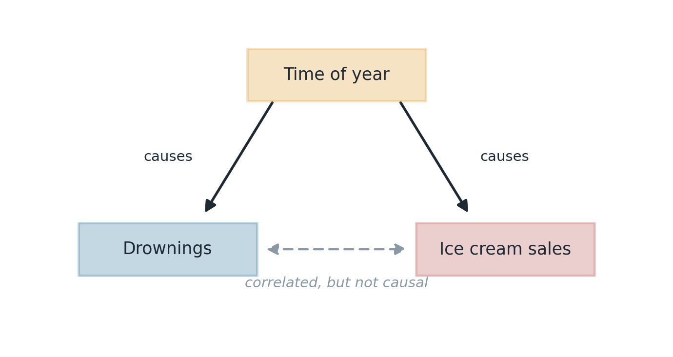
There is a hidden **confounder** — in this case time of year — that is really
driving the relationship between the two variables.
We didn't cover this in class, but there is a tool in probability called the
**law of total probability** that explains exactly how this happens.
## Building up to it
Recall that the probability of a union of two mutually exclusive events is the
sum of their probabilities:
$$
P(A \cup B) = P(A) + P(B) \qquad \text{if } A \cap B = \emptyset .
$$
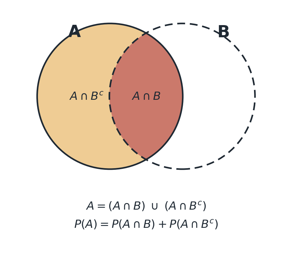
Now consider an event $A$ and an event $B$, and write $A$ as
$$
A = (A \cap B) \cup (A \cap B^{c}),
$$
breaking $A$ into two pieces. These two pieces are mutually exclusive and they
cover all of $A$, so the "total" probability of $A$ decomposes into parts:
$$
P(A) = P(A \cap B) + P(A \cap B^{c}).
$$
{#fig-venn width=85%}
## More than two pieces
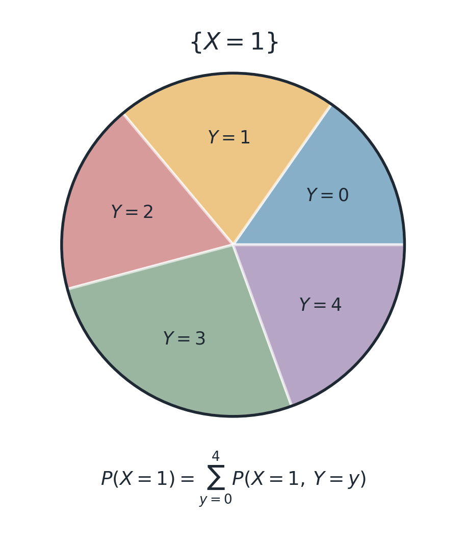
Consider two discrete random variables: $X$, which takes values $0, 1$, and $Y$,
which takes values $0, 1, 2, 3, 4$. The probability $P(X = 1)$ can be decomposed
into "$X$ is 1 and $Y$ is whatever it likes":
$$
P(X = 1) = \sum_{y = 0}^{4} P(X = 1,\, Y = y).
$$
The event $\{X = 1\}$ is a single blob, and the values of $Y$ carve it into five
chunks that don't overlap and don't miss anything.
{#fig-partition width=65%}
## The law of total probability
Now recall conditional probability:
$$
P(X = 1,\, Y = 3) = P(X = 1 \mid Y = 3)\, P(Y = 3).
$$
Substituting that into each chunk gives the **law of total probability**: for any
random variables $X$ and $Y$, where $Y$ has state space $\Omega$,
$$
\boxed{\;P(X = x) = \sum_{y \in \Omega} P(X = x \mid Y = y)\, P(Y = y)\;}
$$
# Applying it to our example
Let's apply this to ice cream, drownings, and time of year. Consider
$$
P(\text{ice cream is high} \mid \text{drownings are high}).
$$
Is this more than 50%, do we think?
Let's break the condition down into parts using $Y$, the time of year. (Because
everything here is already conditional on drownings being high, we use the
conditional form of the law, in which the weights are also conditioned on $D$
being high.)
$$
\begin{aligned}
P(\text{IC high} \mid D \text{ high}) =\;
& P(\text{IC high} \mid D \text{ high},\, Y = \text{winter})\, P(Y = \text{winter} \mid D \text{ high}) \\[4pt]
+\; & P(\text{IC high} \mid D \text{ high},\, Y = \text{summer})\, P(Y = \text{summer} \mid D \text{ high})
\end{aligned}
$$
Now, by construction, ice cream and drownings have **no relationship once you
also know the time of year**. That is exactly how we simulated the data. So the
conditioning on $D$ drops out of the first factor in each term:
$$
P(\text{IC high} \mid D \text{ high},\, Y = \text{winter}) = P(\text{IC high} \mid Y = \text{winter})
$$
$$
P(\text{IC high} \mid D \text{ high},\, Y = \text{summer}) = P(\text{IC high} \mid Y = \text{summer})
$$
which leaves
$$
P(\text{IC high} \mid D \text{ high}) =
\underbrace{P(\text{IC high} \mid Y = \text{winter})}_{\text{small}} \underbrace{P(\text{winter} \mid D \text{ high})}_{\text{small}}
+ \underbrace{P(\text{IC high} \mid Y = \text{summer})}_{\text{large}} \underbrace{P(\text{summer} \mid D \text{ high})}_{\text{large}}.
$$
And now the mechanism is completely visible. **If drownings are high, it is most
likely summer. If it is summer, then ice cream sales are high.** The association
travels from $D$ up to $Y$ and back down to ice cream — never directly.
We can check that chain against the simulated data:
```{r}
#| label: lotp-check
ice_cream |>
  mutate(
    d_high  = drownings > median(drownings),
    ic_high = sales > median(sales)
  ) |>
  filter(d_high) |>
  summarise(
    `P(summer | D high)`  = mean(time_of_year == "Summer"),
    `P(IC high | D high)` = mean(ic_high)
  )
```
## Confounders
Time of year here is a **confounder**: a hidden variable I cannot see that is
affecting the relationship between my response variable and my explanatory
variable.
{#fig-dag width=80%}
To tease out a causal relationship, you must remove the effect of *all*
confounders, so that the only relationship being studied is the one between the
response and the explanatory variable.
::: {.callout-note}
## Coming up on Monday
How this can actually be done in practice — **randomized control trials**.
:::
# Does causation even matter, or is it all about prediction?
It depends on what you want to do with your answer.
## When prediction is all you need
Imagine I am a computer that manages an ice cream store. My job is to stock ice
cream each day to meet demand. For some reason, nobody tells me what time of year
it is — I only get told how many people drowned yesterday, and I have to predict
tomorrow's sales.
In that case, even though there is no causal relationship, I **should** use the
increase in drownings to buy more ice cream tomorrow:
```{r}
#| label: prediction
naive_model <- lm(sales ~ drownings, data = ice_cream)

new_days <- tibble(drownings = c(4, 18))

new_days |>
  mutate(predicted_sales = predict(naive_model, newdata = new_days))
```
Roughly 5 boxes (the winter average) on a low-drowning day, roughly 20 (the
summer average) on a high-drowning day. So my "bad" linear model from before
**is** useful for prediction, even though there is no causal connection. The
drowning count is serving as a proxy for the season I was never shown.
## When prediction is not enough
Now suppose that, as the US Congress, I am alarmed about the increase in
drownings in the country. So we pass a law banning all ice cream sales, in the
hope of saving lives.
Since there is no causal link, this will not change drownings at all. People will
still go swimming in the summer even if they cannot buy ice cream.
Here we are talking about a **counterfactual**. Say we observe 10 people who
drowned, 8 of whom ate ice cream, and 10 people who did not drown, only 2 of whom
ate ice cream. Little known to me, the first group was in summer and the second
was in winter.
I never get to see:
- Would the first 10 have drowned if they had **not** eaten ice cream?
- Would the second 10 have drowned if they **had** eaten ice cream?
If you want to study these counterfactual claims — things that did not occur —
you have to establish causality. No amount of predictive accuracy will get you
there.
::: {.callout-tip}
## The one-line summary
A model that predicts well tells you what the world *looks like*. Only a causal
model tells you what the world would do *if you reached in and changed
something*.
:::