Summarizing Numerical Associations
Correlation and the least squares line
WarningThis page covers…
- Scatter plots to visualize the relationship between 2 numerical variables
- Correlation coefficient to measure the strength and direction of a linear relationship
- Formula of the correlation coefficient
- Properties of the correlation coefficient
- The Simple linear model
- The least squares line
- Formulas to obtain the slope and intercept coefficients
- Using a linear model to obtain predictions
- Calculating residuals to assess predictions
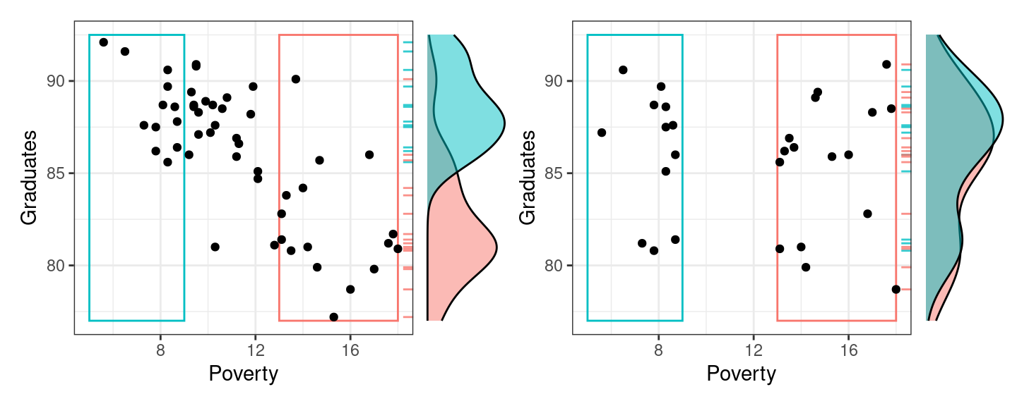
Which of the following plots do you think shows the true relationship between the high school graduation rate and the poverty rate among the 50 US states? (One plot has real data, the other is fake).
If you guessed the plot on the left, you are correct 🎉.
States with higher poverty rates tend to have lower graduation rates. This is a prime example of two variables that are associated. In a previous set of notes we defined association between two categorical variables, but lets replace that with a more general definition that can apply here.
- Association
- There is an association between two variables if knowing one variable tells you something about the other. For example, knowing that someone is 7 feet tall tells you that their weight is probably 200+ pounds. Weight and height are associated.
More technically, two variables are associated if the conditional distribution of one changes as you move across values of the other.
“Conditional distribution” just means “distribution given some constraint.” For example, the distribution of human weights given that they are over 6 feet tall is a conditional distribution. It will tend to have larger weights than usual, as taller people tend to be heavier.
You can detect associations in scatter plots by scanning from left to right along the x-axis and determining whether or not the distribution of the y-variable changes as you move.
- In the figure below, when you look first to the states with low poverty rates (in the blue box), you find that the conditional distribution of the graduation rate (represented by the blue density curve along the right side of the scatter plot) is high: most of those states have graduation rates between 85% and 90%.
- When you scan to the right in that scatter plot, effectively conditioning on having a high poverty rate (the states in the red box), the conditional distribution shifts downwards. Those states have graduations rates in the low 80%s.
These density curves are conditional distributions because we’ve set a condition on the data we’re visualizing. When focusing on the data that’s in the blue box, for example, we’ve in effect set up a filter where Poverty < 9.
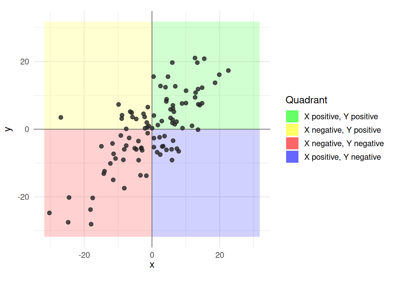
The plot below, by contrast, exhibits no clear association between poverty rate and graduation rate. When we compare the low poverty states with the high poverty states, their conditional distributions of graduation rate are essentially the same (the density curves on the right are closely overlapping).
So we can use the simple scatter plot to determine whether or not two numerical variables are associated, but sometimes a graphic isn’t enough. In these notes we’ll move from graphical summaries to numerical summaries and construct two different-but-related approaches to capturing these associations in numbers: the correlation coefficient and the simple linear model.
In general, when considering the structure in a scatter plot, pay attention to the following aspects:
The strength of the association: How much does the distribution of y change when you move along the x?
The shape of the association: Linear? Quadratic? Cubic or beyond?
The direction of the association (if linear): Positive or negative?
Possible outliers or observations that deviate from the overall pattern.
The Correlation Coefficient
Roughly speaking, the “correlation coefficient” answers the question: “how much do these variables move together?”
For example, as height increases, weight tends to increase (so height and weight have a “positive” correlation). As age increases, eyesight tends to worsen (a “negative” correlation). We represent the strength of this relationship with a number from -1 to 1 (with 0 meaning “no correlation”).
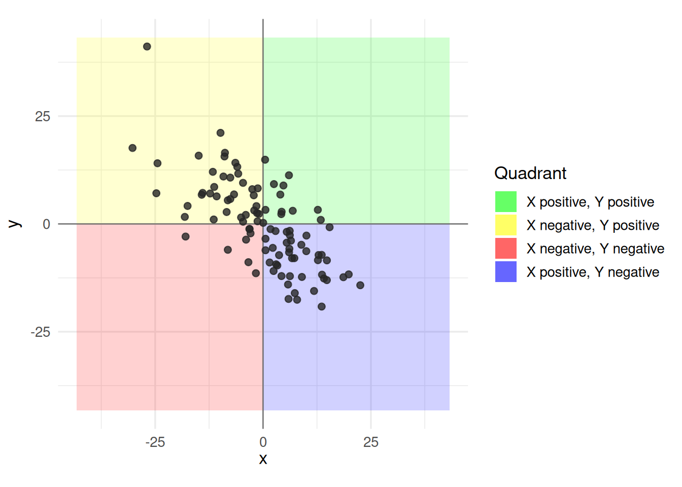
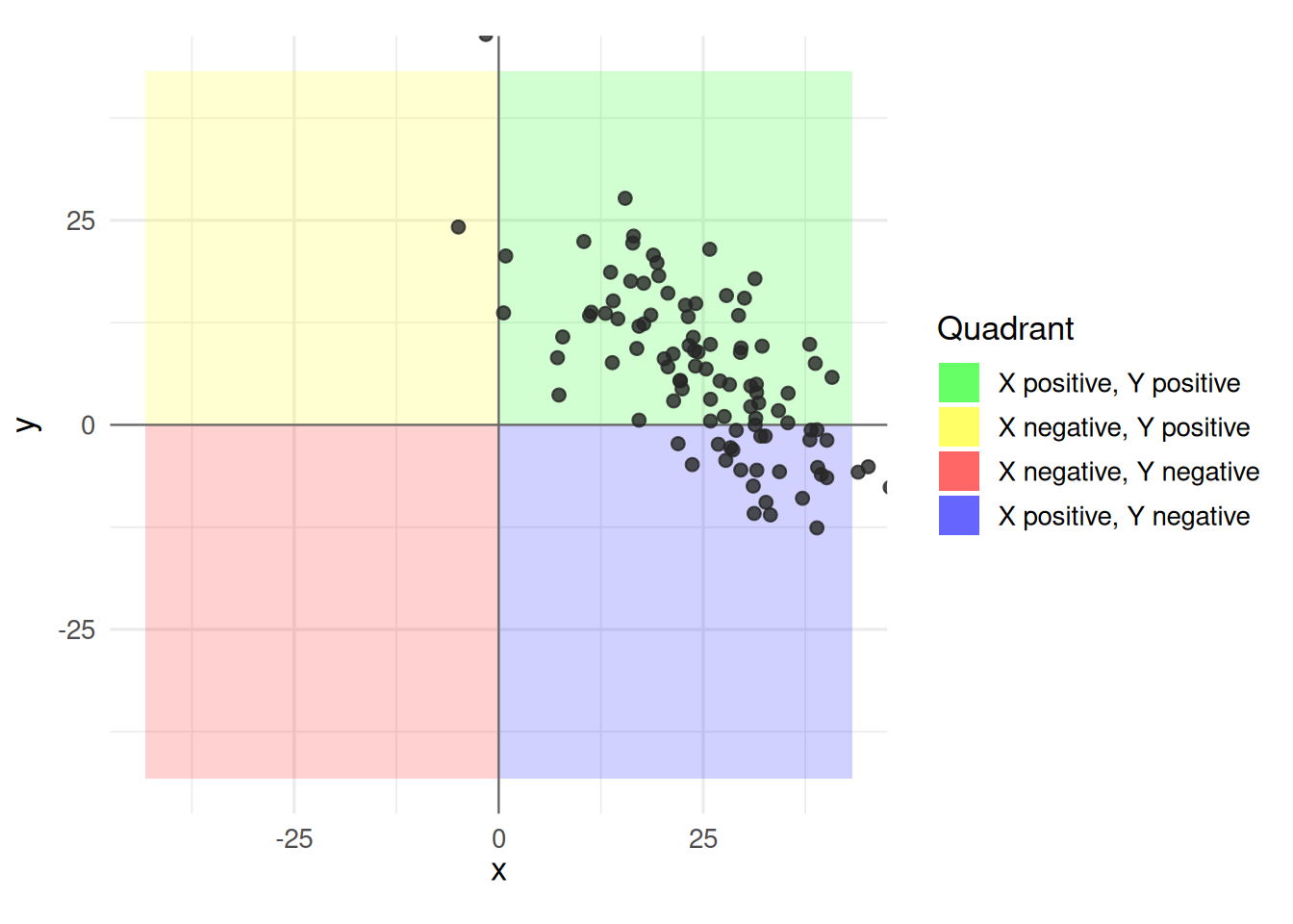
Look at these examples to build some intuition before we dig in further:
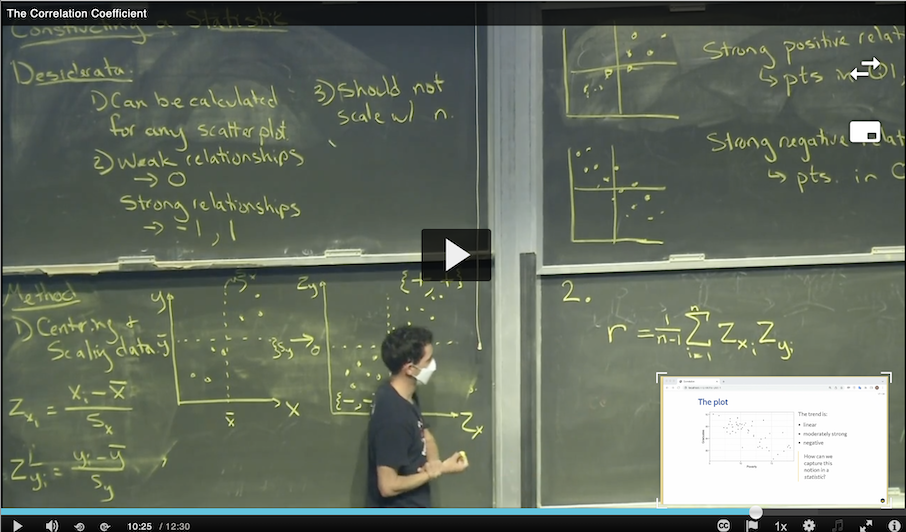
Now, please watch the following 12 minute video on the math and underlying intuition:
- Correlation coefficient, \(r\)
- The correlation coefficient, \(r\), between two variables \(x\) and \(y\) in a sample is \[r = \frac{1}{n-1}\sum_{i=1}^n \left( \frac{x_i - \bar{x}}{s_x} \right) \left( \frac{y_i - \bar{y}}{s_y} \right)\]
where: \(\bar{x}\) and \(\bar{y}\) are the means of \(x\) and \(y\), \(S_x\) and \(S_y\) are the standard deviations, and \(n\) is the number of observations.
Luckily, you won’t have to calculate this yourself by hand. R has a function to do it for you: cor().
NoteHelp me understand this formula? (Optional)
Let’s break it down in pieces.
Part 1
\[\sum_{i=1}^n\]
If you’re not used to summations, what this means is that it’s going to walk through every number from 1 to n (where “n” is how many data points we have) and compute the thing to the right. Then it’s going to add them all up. So \(\sum_{i=1}^3{i^2} = 1 + 4 + 9 = 14\)
Part 2
\[\left( \frac{x_i - \bar{x}}{s_x} \right)\]
Our data looks something like this:
| x | y |
|---|---|
| 0.1 | 0.34 |
| -0.24 | 1.45 |
| 1.1 | -0.07 |
| … | … |
The first x value (0.1) is \(x_1\). The next x value is (-0.24) is \(x_2\) and so forth. \(\bar{x}\) is the mean of ALL the x values, and \(S_x\) is the sample standard deviation (roughly, how far from the mean is a typical x value).
All together, this part of the formula is saying, “For this x value, how far is it from the mean, in standard deviations?”
For example, say the mean of all x values is 10, and the standard deviation is 5. An x with a value of 15 is exactly 1 standard deviation above the mean (\(\frac{15 - 10}{5} = 1\)), while an x with a value of 0 will be two standard deviations below the mean (\(\frac{0 - 10}{5} = -2\)).
The y part of the forumula follows the same idea: \(\left( \frac{y_i - \bar{y}}{s_y} \right)\)
Part 3
\[\left( \frac{x_i - \bar{x}}{s_x} \right) \left( \frac{y_i - \bar{y}}{s_y} \right)\]
Now we multiply these x and y pieces. For a given point (\(x_i\), \(y_i\)), we convert it into standard-deviation-distances from the means, then multiply them.
Example:
- x mean (\(\bar{x}\)) = 10
- x standard deviation (\(S_x\)) = 5
- y mean (\(\bar{y}\)) = 4
- y standard deviation (\(S_y\)) = 2
For a given point, say, (20, 3), we compute:
- x in standard deviations: \(\frac{x_i - \bar{x}}{s_x} = \frac{20 - 10}{5} = 2\)
- y in standard deviations: \(\frac{y_i - \bar{y}}{s_y} = \frac{3 - 4}{2} = -0.5\)
We now multiply them 2 * -0.5 to get -1.
Notice that this number is negative. In this case, x and y moved in opposite directions. X was above its mean, but y was below. If this tends to be the case across the whole dataset, we’ll have a negative correlation in the end.
Part 4: Bringing it all together
We do the math above for every (x, y) pair in our dataset, getting a bunch of numbers, then we essentially average them to get the correlation coefficient, r.
\[r = \frac{1}{n-1}\sum_{i=1}^n \left( \frac{x_i - \bar{x}}{s_x} \right) \left( \frac{y_i - \bar{y}}{s_y} \right)\]
We add them all up (\(\sum_{i=1}^n\)), and divide by (one less than) how many of them there are (\(\frac{1}{n-1}\)).*
That’s it. That’s the correlation coefficient. Hopefully this makes the formula more intuitive for you.
*Note: We use “n-1” instead of “n” when working with samples (versus entire populations), for reasons that are a little beyond our scope here.
Several different statistics have been proposed for measuring association. This is the most common and is more specifically called the Pearson correlation.
Example: Poverty and Graduation rate
The data frame used to create the scatter plot above on the left looks like this.
select(poverty, Graduates, Poverty)# A tibble: 51 × 2
Graduates Poverty
<dbl> <dbl>
1 79.9 14.6
2 90.6 8.3
3 83.8 13.3
4 80.9 18
5 81.1 12.8
6 88.7 9.4
7 87.5 7.8
8 88.7 8.1
9 86 16.8
10 84.7 12.1
# ℹ 41 more rowsSince it is a data frame, we can use the summarize() function to calculate our summary statistic.
poverty |>
  summarize(r = cor(Poverty, Graduates))
# A tibble: 1 × 1
r
<dbl>
1 -0.747The value of -0.747 tells us that the linear association between these variables is negative and reasonably strong. This is our first example of a bivariate summary statistic: there are two variables that we put inside the cor() function to compute our statistic.
Let’s repeat this calculation for the data frame that created the shapeless scatter plot with no association, shuffled_data.
shuffled_data |>
  summarize(r = cor(Poverty, Graduates))
# A tibble: 1 × 1
r
<dbl>
1 -0.0546As expected, that scatter plot yields a correlation coefficient very close to zero because the points are scattered across all four quadrants of the plot.
Properties of \(r\)
Like any numeric summary, the correlation coefficient has a set of core properties:
- 1. It Always Stays Between -1 and +1
- The value of \(r\) will never be less than -1 and never be greater than +1.
\[-1 \le r \le 1\]
- Note: If you ever calculate an \(r = 1.2\) or \(r = -2.5\), a math error occurred!
- 2. The Sign Tells You the Direction
- The plus or minus sign tells you which way the relationship moves on a scatterplot.
- Positive correlation (\(r > 0\)): The variables move in the same direction. As \(X\) increases, \(Y\) tends to increase (e.g., study hours and exam scores). The trend line slopes upward.
- Negative correlation (\(r < 0\)): The variables move in opposite directions. As \(X\) increases, \(Y\) tends to decrease (e.g., car weight and fuel efficiency). The trend line slopes downward.
- 3. The Number Tells You the Strength
- The closer \(r\) is to the extremes (-1 or +1), the stronger the relationship. The closer \(r\) is to 0, the weaker the relationship.
- \(r = 1\): Perfect positive linear relationship. All data points fall exactly on an upward-sloping straight line.
- \(r = -1\): Perfect negative linear relationship. All data points fall exactly on a downward-sloping straight line.
- \(r = 0\): No linear relationship at all. The data looks like a random cloud of points.
- 4. It Only Measures Linear Relationships
- The correlation coefficient is blind to curved patterns. It only tests how well the data fits a straight, sloped line.
- Warning The “sloped” is key here – if all the data fit on a perfectly horizontal line (slope = 0), the correlation is zero! To see why, think back to our definition of “association” in general. For a horizontal-line, no matter what the x value is, y is always the same. This is the very definition of “no association.” The correlation (a measure of association) is zero.
- Warning: A dataset could have a perfect, predictable curved relationship (like a U-shaped parabola), but \(r\) might still equal 0. It fits a curved line well, but not a straight line. Correlation is about straight lines.
- 5. It Has No Units of Measurement
- Because of how \(r\) is mathematically standardized, it is just a pure number.
- If you correlate height (in inches) and weight (in pounds), \(r\) does not have a unit like “inches-per-pound.” It is just a decimal. All the units dropped out in our math!
- 6. Changing Units Does Not Change \(r\)
- Because it has no units, \(r\) stays exactly the same even if you convert your data scale.
- If you scale heights from inches to centimeters, or weights from pounds to kilograms, the correlation coefficient remains identical.
- This is a key advantage of the correlation coefficient!
- 7. Switching \(x\) and \(y\) Does Not Change \(r\)
- Correlation measures the relationship between two variables; it does not care which one is the explanatory and which is the response.
\[\text{corr}(x,y) = \text{corr}(y,x)\]
- The correlation between height (\(x\)) and weight (\(y\)) is identical to the correlation between weight (\(x\)) and height (\(y\)).
- Try it out yourself to verify!
- 8. It Is Extremely Sensitive to Outliers
- A single unusual data point that sits far away from the rest of the group can drastically alter \(r\).
- An outlier can make a strong relationship look weak, or it can make a completely random dataset look like it has a strong correlation. Always look at a scatterplot first!
- 9. Correlation \(\neq\) Causation
- This is one of the golden rule of statistics. Just because two variables have a high \(r\) value does not mean that changing \(x\) causes \(y\) to change, nor vice-versa. It might be causal, but you can get a high \(r\) without causality:
- They might both be influenced by a hidden third variable (called a lurking or confounding variable). For example, ice cream sales and sunburns are highly correlated, but buying ice cream does not cause sunburns – hot summer weather causes both.
- It’s also true that a low correlation (e.g. \(r = 0\)) does not rule out a causal relationship! For example, think about the relationship between “the temperature outside” and “how much people complain about the temperature outside.” Clearly these have a causal relationship - people complain when it’s very hot or very cold… but not when it’s mild. So there’s a U-shaped relationship between “temperature” and “complaining about temperature.” That’s a curve, not a straight line, so \(r\) might be very small even though temperature obviously causes complaints about temperature.
NoteProof in code (Optional)
Here’s some data that has a perfect U-shaped relationship, but a correlation of almost zero. Don’t worry if you don’t follow all of the code (but it might inspire you to try it!) - just note the correlation coefficient is close to zero, but there’s obviously a causal relationship here.
set.seed(777)  # So we always get the same random points

npoints <- 100
ideal_temp <- 70
temperature = seq(ideal_temp - 40, ideal_temp + 40, length.out = npoints)
complaints = 5 + ((temperature-ideal_temp)/10)^2 + rnorm(npoints, sd = 0.75)

r = cor(temperature, complaints) |> round(2)

data.frame(temperature, complaints) |>
  ggplot(aes(x = temperature, y = complaints, color = temperature)) +
    geom_point() +
    labs(x = "Temperature (°F)",
         y = "Complaints about Temperature") +
    labs(title = "Extreme temperatures cause complaints",
         subtitle = paste("Correlation =", r)) +
    scale_color_gradient2(
      low = "blue", mid = "gray", high = "red", midpoint = ideal_temp) +
    scale_x_continuous(breaks = seq(ideal_temp - 40, ideal_temp + 40, by = 10))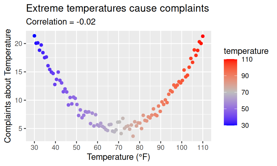
The Simple Linear Model
Another approach to summarizing the linear association is to just … draw a line.
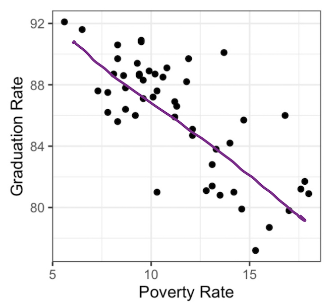
This line serves both as a graphical summary and also as a numerical summary. After all, every line that you draw on a scatter plot is defined by two numbers: the slope and the y-intercept. This line is called a simple linear model.
We call this a model because it is a simplified mathematical representation of reality designed to help us explain patterns or make predictions. We call it linear because the model assumes the relationship follows a straight line rather than a curve. Finally, we call it simple because it uses only one explanatory variable (\(x\)) to predict the response variable (\(y\)). More explanatory variables can be added to the model—giving a multiple linear regression—but starting with just one variable keeps the model “simple”.
- Simple Linear Model
- An expression for a possible value of the \(y\) variable, \(\hat{y}\), as a linear function of the \(x\) variable with slope \(b_1\) and y-intercept \(b_0\). \[\hat{y} = b_0 + b_1x\]
Therefore, a simple linear model captures the linear relationship of two variables in not one but two summary statistics, \(b_0\) and \(b_1\).
For the line above, we can do our best to eye-ball these. The line appears to rise -2 percentage points for every 2.5 that it runs, so I’d estimate the slope to be about \(-2/2.5 = -0.8\). If I were to draw the line all the way to the left until it crossed the y-axis at a poverty rate of 0, its y-intercept would be around 95. So I could express the line that is drawn above as:
\[\hat{y} = 95 - 0.8 x\]
The Least Squares Line
If that felt a little shifty to you - drawing a line by hand and then eyeballing its slope and intercept - we can be more precise by using a more optimized type of linear model: the least squares line. This is a method that we’ll study in depth when we get to the unit on prediction, but for now, we’ll use it because it makes calculation very easy. You can find the slope and intercept of the least squares line using statistics that we’re already familiar with the following 5 ingredients: \(\bar{x}, \bar{y}, s_x, x_y\), and \(r\).
- Least Squares Slope
- We always start with the slope: \[ b_1 = r \frac{s_y}{s_x} \]
- Least Squares Intercept
- Having obtained the slope, we obtain the intercept: \[ b_0 = \bar{y} - b_1 \bar{x}\]
NoteHelp me understand this formula? (Optional)
Part 1
We can break the slope formula down into two primary components:
- 1.1) The Scale Factor (\(\frac{s_y}{s_x}\))
- Sample data comes with physical units of measurement (e.g., height in inches vs. weight in pounds). The ratio of the sample standard deviations, \(\frac{s_y}{s_x}\), acts as a unit converter or scale factor.
It answers the question: If \(x\) changes by 1 standard deviation, how many standard deviations does \(y\) naturally spread? It translates the scale of the predictor variable into the scale of the response variable.
- 1.2) The Correlation (\(r\))
- The correlation coefficient \(r\) ranges from \(-1\) to \(+1\) and supplies two crucial pieces of information:
- Direction: The sign of \(r\) gives the line its direction. If \(r\) is negative, the slope must be negative.
- Strength: \(r\) dictates how much of the variability in \(y\) is actually passed through from \(x\).
Putting these two pieces together gives an intuitive way to frame the formula:
\[\text{Slope } (b_1) = (\text{Correlation}) \times (\text{Ratio of Variabilities})\]
Part 2
The formula for the \(y\)-intercept \(b_0\) is:
\[b_0 = \bar{y} - b_1 \bar{x}\]
It helps to view this formula as a **baseline adjustment from the center of the data.
- 2.1) The Regression Line’s Anchor Point: \((\bar{x}, \bar{y})\)
- A fundamental property of ordinary least squares (OLS) regression is that the regression line always passes through the point of averages, \((\bar{x}, \bar{y})\).
This means that if a data point has an average value for \(x\), our best baseline prediction for \(y\) is simply the overall mean, \(\bar{y}\).
- 2.2) Backing Up to \(x = 0\)
- To find the value of \(y\) when \(x = 0\), we start at our anchor point \((\bar{x}, \bar{y})\) and step backward along the \(x\)-axis until we reach \(x = 0\):
- The distance from \(\bar{x}\) back to \(0\) is \(\bar{x}\) units.
- Because the line has a slope of \(b_1\), every 1-unit step in \(x\) changes \(y\) by \(b_1\).
- Stepping backward by \(\bar{x}\) units changes \(y\) by \(b_1 \bar{x}\).
Subtracting \(b_1 \bar{x}\) from \(\bar{y}\) adjusts our average baseline to account for how far the average \(\bar{x}\) is from zero.
Example (cont’d): Poverty and Graduation rate
So how does this line look compared to the hand-drawn line? Let’s calculate the slope and intercept and add the resulting line to our scatter plot.
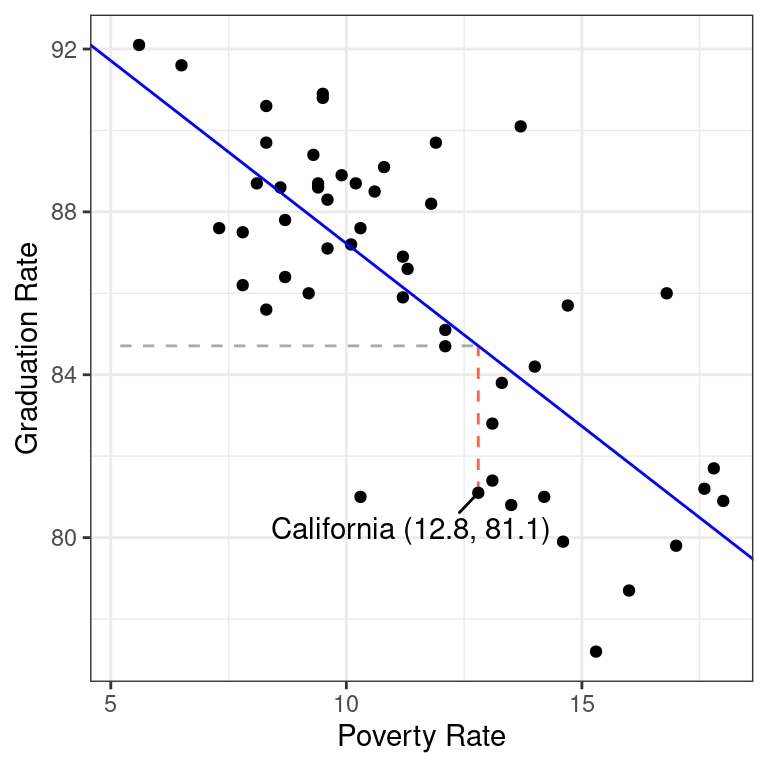
That works remarkably well!
We can use R to find the least squares line using the all-mighty function lm(), which stands for linear model. Among other things, this function gives you the least squares slope and intercept.
lm(Graduates ~ Poverty, data = poverty)
Call:
lm(formula = Graduates ~ Poverty, data = poverty)

Coefficients:
(Intercept)      Poverty
    96.2022      -0.8979
The syntax for lm() uses what’s called “formula notation” in R. The first argument is a formula of the form y ~ x and can be read as, “Explain the y as a function of the x”. In the second argument, you specify which data frame contains the variables used in the formula.
- Interpretation of Slope
- So if the correlation coefficient measures the strength of the linear relationship between two variables, what exactly are the slope and intercept measuring? The slope captures the expected change in the \(y\) associated with the \(x\) changing by 1 unit. In this example, states that are separated by 1 percentage point in their poverty rate tend to be separated by about -.89 in their graduation rate. This is distinct from what the correlation tells us because while \(r\) will stay the same regardless of the units in which the data is measured, \(b_1\) is expressly designed to tell us how those units of measurement relate to one another.
- Interpretation of Y-intercept
- What about the intercept? It tells us the value that we’d expect the \(y\) to take when the \(x\) takes a value of zero. Sometimes that’s an informative statistic, sometime it is not. In this setting, do you really expect the graduation rate to be around 96% when their poverty rate is zero? What would it even look like for a state to have a poverty rate of zero? The abstraction of the linear model allows us to ponder such a world, but the reality of economics in the US is that we would never actually observe poverty rates of zero.
So what good is the intercept? Well, it’s useful in helping us calculate a residual.
Residuals
One of the benefits of explaining the association between two variables with a line instead of just the correlation coefficient is that it allows us to calculate what we would expect an observation’s y-value to be based on its x value, so that we can see how far our expectation is from reality. That gap between expectation and reality is called a residual.
- Residual (\(\hat{e}_i\))
- The difference between the observed value of a data point, \(y_i\), and the value that we would expect according to a linear model, \(\hat{y}_i\). \[ \hat{e}_i = y_i - \hat{y}_i \]
\(\hat{y}_i\) is said “y hat sub i” and is also called the “fitted value”.
Let’s calculate the residual for California. Here is that row in the data set.
poverty |>
  filter(State == "California") |>
  select(State, Graduates, Poverty)
# A tibble: 1 × 3
State Graduates Poverty
<chr> <dbl> <dbl>
1 California 81.1 12.8This shows us that for California, \(y = 81.1\), so the next step is to find where the line passes through California’s x-value, \(x = 12.8\). There are several ways to do that calculation, including using R like a calculator and simply plugging that value into the equation for the line show above.
y_hat <- 96.2022 - 0.8979 * 12.8
y_hat
[1] 84.70908With that in hand, we can calculate California’s residual.
81.1 - y_hat[1] -3.60908This residual tells us that California is actually a bit of an underachiever. Among states with a poverty rate around 12.8, we would expect their graduate rate to be around 84.7. California’s rate, however, is 81.1, a decrease of 3.6.
The calculation of the residual can be seen in the plot below.
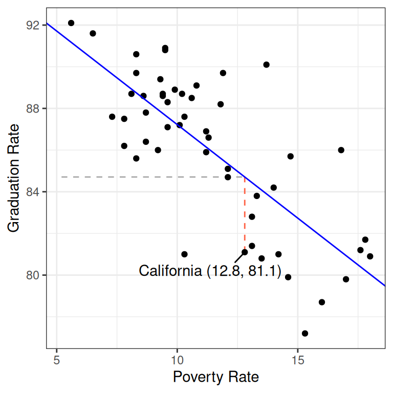
The horizontal dashed line represents \(\hat{y} = 84.7\), the y-value of the least squares line when it passes through \(x = 12.8\). The vertical red dashed line is the residual: the distance between the line and the observation in the y direction.
Residuals open up a new avenue for numerical statistics. While the slope and intercept are two statistics that tell us about the overall linear relationship between the two variables, each residual is a statistic that tells us whether an individual observation’s y-value is higher or lower than we’d expect based on its x-value.
If you have \(n\) data points, you can calculate \(n\) residuals.
Summary
In these notes we considered the question of how to capture the association between two variables with visualizations and numerical summary statistics. The correlation coefficient is one of the most common: it captures the strength and direction of the linear trend. This statistic can be used, along with other simple summary statistics, to calculate the slope and intercept of the least squares line. The least squares line is an alternative approach to summarizing the linear relationship between two numerical variables. It has the advantage of providing an expectation for the y-value of every observation, which allows us to calculate residuals which are expressions of whether each observation is higher or lower than we’d expect.
We’ll spend time practicing calculating these statistics - and looking at lots of scatter plots - in class. We’ve also prepared a tutorial to help you become adept at working with linear models in R.