A Grammar of Graphics
Agenda
- Announcements
- Reading Questions
- Break
- Appendix: More practice!
- Worksheet
Anouncements
- Portfolio 2 due Friday
- Lab 2 due Next Tuesday (I had originally said this Friday, but we will cover things in tomorrow’s lecture that are needed so a bit longer due date)
- Quiz 1 this week on Thursday
- Practice problems released tomorrow
Concept Questions
Which of these geometries typically go with aesthetic mappings where there are two numerical variables, one on the x axis and the other on the y axis? Select all that apply.
- A. Violin
- B. Dot
- C. Point
- D. Line
- E. Box
00:45
How is a stacked, normalized bar chart defined in terms of the grammar of graphics?
A. one categorical variable mapped to the x-axis, using the bar geometry.
B. one categorical variable mapped to the x-axis, a second categorical variable mapped to the y-axis, using the bar geometry.
C. one categorical variable mapped to the x-axis, a second categorical variable mapped to the fill, using the bar geometry.
D. numerical variable mapped to the x-axis, a second categorical variable mapped to the fill, using the histogram geometry.
00:30
Which of the following describes or is an example of mapping?
A. Adding a theme to a plot.
B. The linking of the aesthetic attributes of a plot to the data in a column of a data frame.
C. Adding an annotation to a plot.
D. The tweaking of all points on a scatter plot in a cosmetic manner.
00:30
True or False: A visualization using the grammar of graphics may contain more than one aesthetic mapping, but not more than one geometry.
- A. True
- B. False
00:30
When conducting exploratory data analysis, who is generally the audience for your plots?
A. Other scientists
B. Yourself
C. The public
D. Your boss
E. Oski
00:30
Break
05:00
Appendix - more practice!
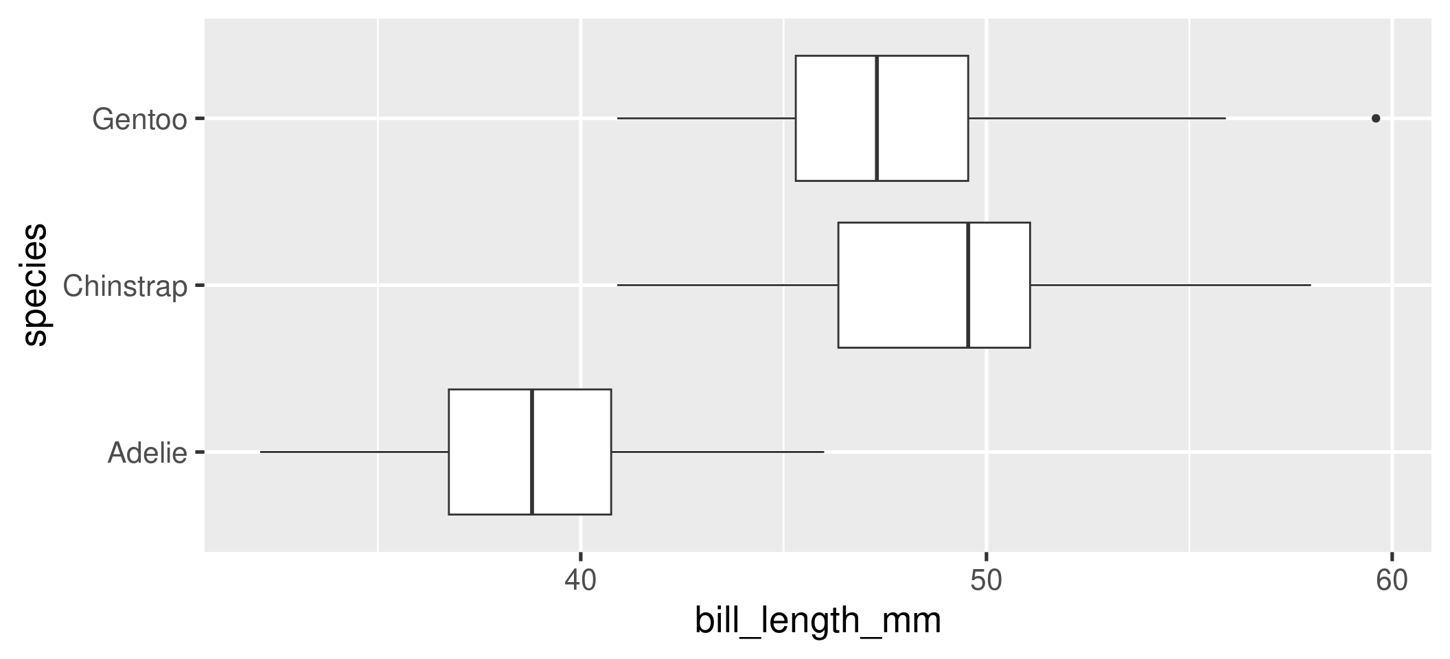
- What are the aesthetics and geometry of this plot?
01:00
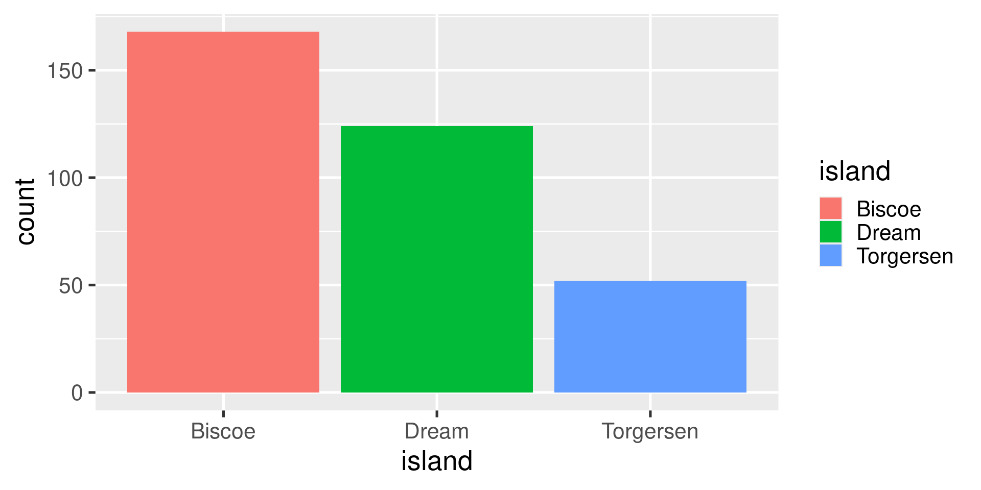
What code was used to make this plot?
01:00
Concept Activity
Concept Activity
You will be watching a 2.5 minute video of a presentation by a scientist, Hans Rosling, who studied global public health. He presents data visualizations depicting the change in life expectancy and family size over several decades in the 20th century.
On a piece of note paper:
- Sketch out the data frame used to create the graphic and add the names of the variables.
- List the aesthetic attributes used to encode the data in the graphic.
- Identify the geometry used in the plot.
Please turn to your neighbors and…
Discuss what you came up with in terms of . . .
- the variables present in the data frame
- the aesthetic attributes used to encode that data in the plot
- the geometry
01:00
What were the variables and aesthetic attributes?
Visual Cues / Aesthetics
- Location along the x-axis
- Location along the y-axis
- Size of point
- Color of point
- Animation
Variables
- Fertility rate
- Life expectancy
- Population
- Region
- Year
What did the data frame look like?
What was the unit of observation? What were the variables? What were their type?
Unit of observation
- A country in a given year
Variables
- Fertility rate (continuous)
- Life expectancy (continuous)
- Population (continuous)
- Region (nominal)
- Year (discrete)
What geometry is used to represent the observations?
- Points
Worksheet: A Grammar of Graphics
25:00